All Things Good
Family Restaurant
Mobile Application
All Things Good Family Restaurant – Case Description
All Things Good Family Restaurant is a family owned restaurant in Buenos Aires. They make a variety of dishes that are all freshly made. Their target market is Families, Couples, and Singles looking to dine in an upscale environment.

The Problem
All Things Good Family Restaurant is a family owned restaurant in Buenos Aires. They make a variety of dishes that are all freshly made. Their target market is Families, Couples, and Singles looking to dine in an upscale environment.
The Goal
Design a restaurant app that entails online pickup/delivery options, a way to make reservations, but most importantly, a way to process payments online.
My Role
Lead UX designer, UX researcher, and Interaction Designer. Designing a solution from conception to delivery.
My Responsibilities
User Research
Wire Frames
Mockups
User Testing
Visual Design
Research Summary
To begin this project, I performed users interview sessions and created empathy maps to better
understand the needs of the users that I was tasked to design a solution for. There was no specific
user group that would benefit from this solution. However, the users could be broken up into
segments such as, Families, Couples, and Single individuals looking to experience a high
quality dining experience.
The users confirmed my assumptions about what was needed for (ATGFR) All Things Good Family
Restaurant. Nonetheless after doing the necessary research, the findings proved that online
payments were a necessity. The users also needed the ability to make reservations and have
multiple payment options such as “Single” vs “Split” payments options.
User research: pain points
Location Preference
Customers needed the ability to see and select the location based on their current location.
Reservations
Due to social distancing measures, customers needed the option to book reservations for dine in purposes.
Order Options
To compete with other restaurant chains, having pickup or delivery options were a must have.
Payment Options
Not only was it important to have multiple ways to pay for orders were of importance, being able to split the check was a huge ask as well.
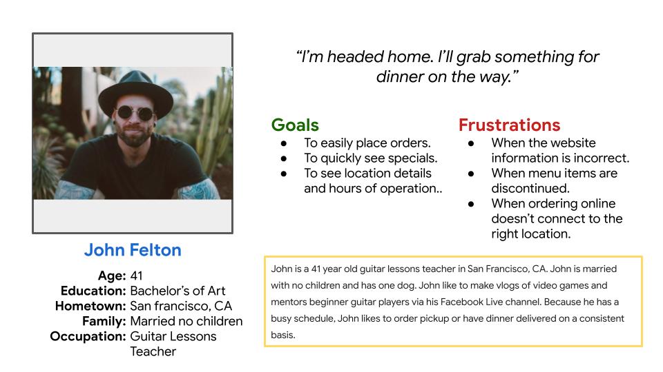
Persona
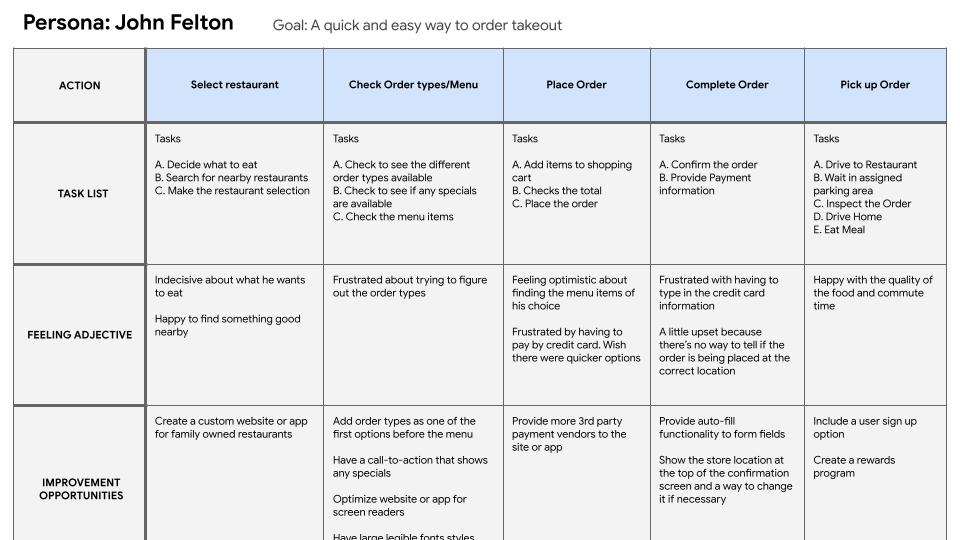
Journey Map
Paper Wireframes
Doing paper wireframes gave me that ability to visualize what the product may look like once the users informations was gathered. They provided a quick way to visualize solutions to user pain points.

Digital Wireframes
During user interviews almost all of the users interviewed said that they check to see what specials are available. Then, they wanted an easy way to see the menu.

Digital Wireframes
Users needed the ability to choose whether to split an order. Having the ability to add multiple orders to a single order or split order was a necessary need.

Low Fidelity Prototype
I created a lo-fi prototype to test with users to gather further information around the flow of the application and the contextual data shown.

Usability study: findings
Round 1
Users wanted to have locations automatically populated.
Users were confused around the payment type label.
Users wanted better calendar functionality for scheduling reservations.
Round 2
Users wanted to see the top closest locations in the locations modal.
Users wanted to see more images of meals throughout the application.
Users wanted to see an engaging success message when the order was completed.
Mockups
During user interview sessions users wanted the ability to see the closest locations. They also needed the ability to add in their locations for use cases of traveling.

Mockups
Users wanted to see the available specials. However, they also wanted to see more images.

Mockups

High-fidelity prototype
The final hi-fi prototype includes the workflow to purchase a meal, choose order method, choose payment order type, and finish the payment process.

Accessibility considerations
Typography
The main body font style throughout the app is 1 rem (16px) nothing falls below a 12px font size.
Color
All colors are based on passing AA Accessibility standards.
Micro Animations
All animations are based on 300 milliseconds, which passes accessibility guidelines.
Takeaways
Impact
This app gives All Things Good Family
restaurant the ability to compete the larger food chains by having an online experience that goes above and beyond the default experiences.
Quote from user testing:
“Now this is what I mean when I say you guys are listing to your customers” – Efomo
What I learned
I learned that even the largest food chains can still increase their user experience. Most companies do not give you the ability to split your order. Having features like this will only improve the users experience as time goes on.
Next Steps
First
Wait until the app is out for at least 3 months before performing another user testing session.
Second
Improve on adding more images of the dishes being sold.
Third
Continue to add more accessibility into the
application by interviewing users that use assistive technologies.